Extreme Makeover: Comet Edition
Hey guys,
We recently invited Kirill (or Xmenekai) to join Team Comet as our level & cutscene artist, but he’s honestly been a bit of an unofficial team member for a while now.
I initially commissioned him to create some art for our animated cutscenes but he quickly became a really important contributor to the project, and a friend. Fast forward about 8 months and all his incredible work has made him an invaluable part of Comet.
If you’ve watched the Playdate Update video today, or seen our Reveal Trailer, you would’ve seen some of his handy work, but I also want to give you a peek at our process by sharing some behind the scenes images and a few ‘befores & afters’ of our new village art.
Play(date)Station Inspiration
There’s always been something cool about the era of early PlayStation RPGs where you’d get to a major moment in a game and a full-motion cutscene brought the world to life. It just made everything feel big and important, ya know?
When I first saw Panels, the interactive comic framework for the Playdate (made famous in Cadin Batrack’s game, The Botanist), I thought it could be a really great way to create cutscenes that give Comet a PlayStation RPG feel but in a way that felt at home on the Playdate. At the time, we didn’t have anybody on the team with the skills to make that happen, so we put in a placeholder scene and moved on, but in the back of my head I was puzzling through how we could pull it off. Maybe an animatic-style cutscene? However we’d do it, I assumed it would need to be simple.
Anchors Aweigh
I’m not an artist, but I’ve done a lot of the tile art for Comet. I try to fill in any gaps in the project to free people up and move us along.
In October 2023 I was working on a boat sprite and sharing my progress with everyone in the art channel of the Playdate Squad Discord, which is when I had my first interaction with Kirill. He had some advice on visual perspective and how to make the scene look less flat.
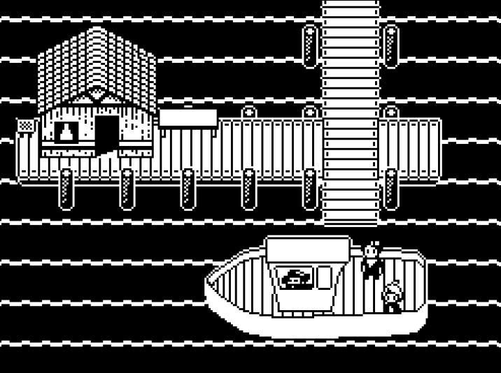
Not long after, I reached out to Kirill, thinking he might be able to help us out. He was eager to try (and underplayed his skill!)
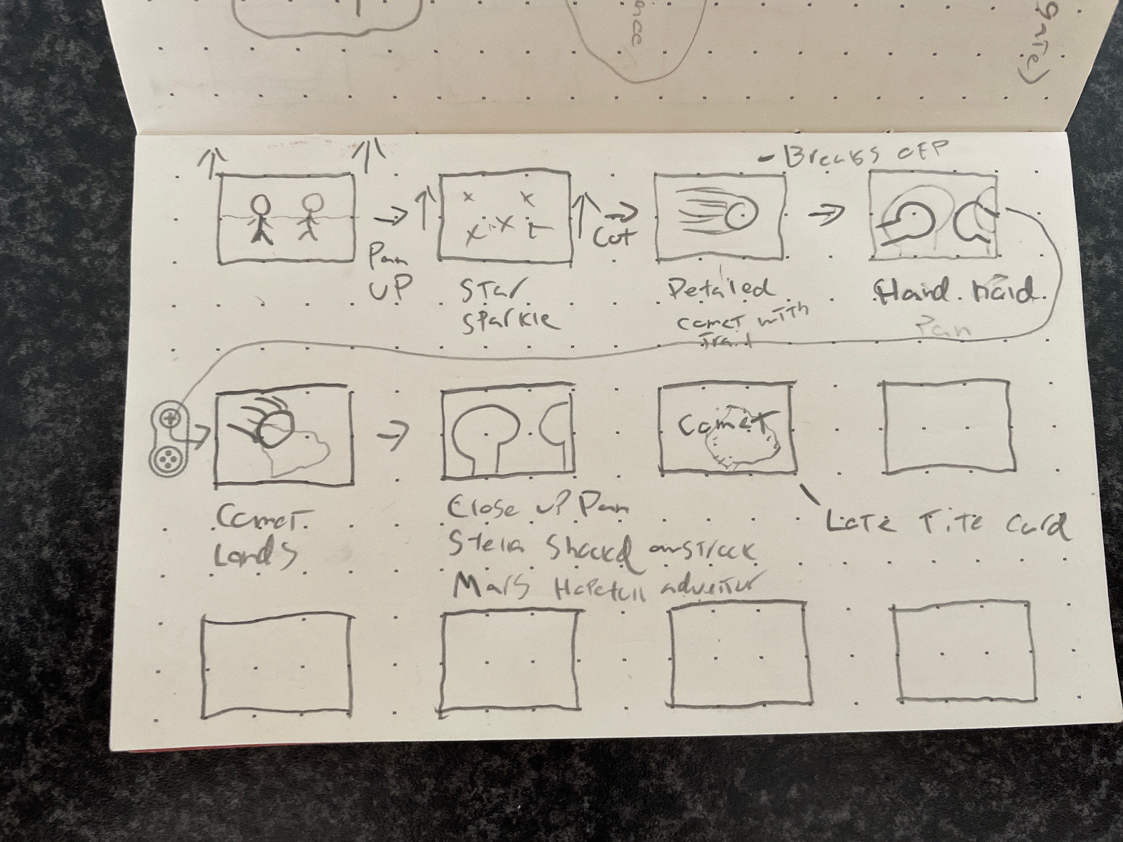
I sat down with Will, our narrative lead, to make a storyboard and outline what we’d want in a cutscene for Comet.
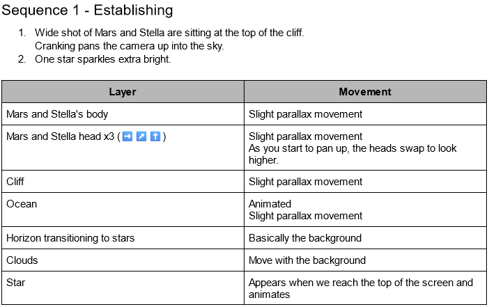
And then I wrote up more detailed requirements for each sequence.
Based on our pitch, Kirill started exploring different ideas.
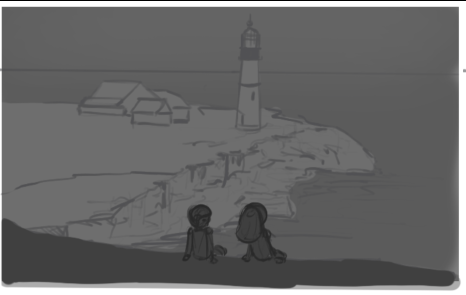
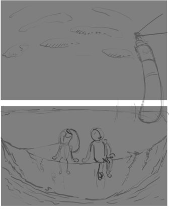
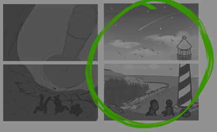
Soon, we settled on something we liked.
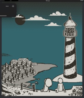
I expected Kirill to support us with art and nothing more, but he went above and beyond. He learned how Panels worked and started building the project himself. That was the first time I was amazed by his work, which already looked great on-device.
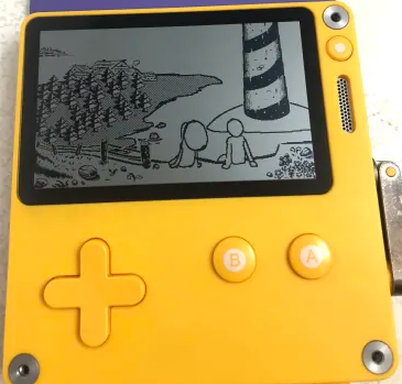
Then in a very short period of time, he drew the rest of the scene.
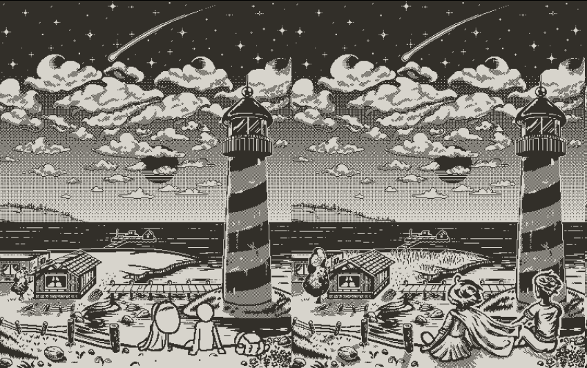
I was floored by him, again. Pretty amazing work.
This scene was so compelling that we wanted to use it in our announcement trailer, but something about it felt a little flat. I asked Kirill if he could add some wind-swept ripples to bring a bit more life to the scene, and he agreed.
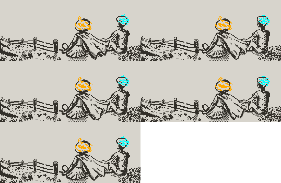
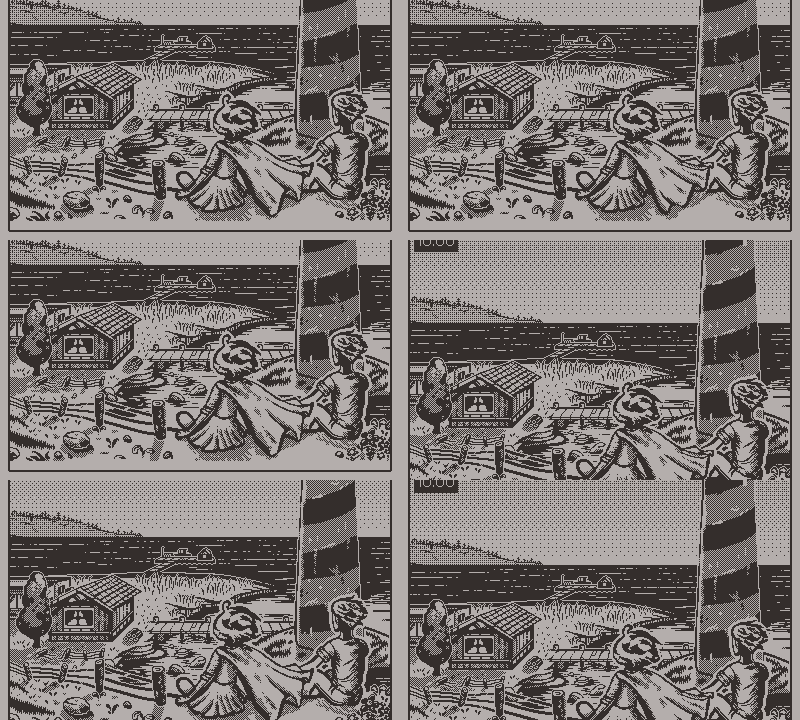
This set a really high standard for the rest of the Panels scenes to live up to. We didn’t think the cutscene would become so big, but I couldn’t hold Kirill back 😅
I look forward to you guys seeing them all when the game releases. Until then, you can watch the trailer to see this scene in all its glory! Now I'll throw over to Kirill to share some of his experience and goals for Comet.
How it Started
Hi there! I’m Kirill. I love pixel art, indie games, and pixel art indie games. I’ve worked on a couple of titles as a level artist (the Unliving, for example) and have been making pixel art for a few years, but I only got serious about it last year. The most important thing for me was growing as an artist and understanding how to learn.
Later, buying Playdate inspired me to try my hand at 1-bit. Artists know that pixel art isn't always as easy as it might seem, and the two-color limitation makes it even trickier, but there's something in it, isn't it?
Those deep dark shadows, bright white lights, dithering. All these things have their own specific character, almost like stippling and cross-hatching in ink or coal art.
Cutscene Mission
So you've already read that my collaboration with Team Comet started with cutscenes made in Panels. It was a very interesting and challenging intro.
I was really impressed by their level of preparation - Donald and Will gave me the whole script with sketches of every chapter, ideas about what it should include, which elements should be interactive, etc. A really detailed plan, which in my experience is a rare case even in bigger game dev.
During the process of creating the cutscene, we went big! Donald mentioned that he didn't expect that, but to be honest I didn't expect it either.
When you make animations in Aseprite, it's just an animation, one continuous sequence of frames. But with Panels you can tell a story and that story can be interactive. That's why I pushed myself to get into code and understand what else I can make there, so I can be more flexible, and fast, and specify what and how things work.
Basically, you have some static sprites, you can place them any way you want, you can add depth with parallax, and then you can animate that all. Idle animations, animations played by the crank, idle animations of an object animated by the crank, etc. Possibilities are limited only by your skill and creativity.
Of course, some parts were harder than others. The falling scene from the latest trailer took the most time and forced me into being very creative.
The work on the cutscenes took a long time, we added tons of details, and some easter eggs across sequences, so I hope you'll like it and don’t just scroll past :D
What's Next?
After the Panels cutscenes were done, I did a couple of updates to the tiles Donald had made. They turned out so good that I'm now on the team. Wow!
It was unexpected, but I've always wanted an opportunity like this so I was ready to dive in.
When it comes to opportunities like this, I have two approaches:
- "Do no harm" - which just means don’t break everything that was made.
- "What if?/Why not to" - which means don't limit yourself and don’t be afraid to explore new ideas.
Seems quite contradictory, right? To make it work, I need to add some self-management to connect all the artistic and pragmatic parts inside me.
My long-term dream is to make Comet art look like a Playdate game that’s AAA, with pixel art on the level of games like Eastward, Sea of Stars and many others. The current plan is to remake what needs to be remade, then sync with the team and make new things.
Since there’s currently some art that needs updating, and I'm catching up, I'm mainly focused on the following 3 points:
🔹Breaking symmetry and clarity
This is more an aesthetic point. I think rough, off-centered, well-used objects look more natural and alive.
🔹Adding details and textures when it’s worth it
The team did an amazing job with interactable objects, and I wanted the same level of detail in the art as well. Thick, juicy texture just makes everything look more vivid.
🔹Adding personalities to houses and objects
Ahh my favorite part. From my previous experience, I discovered a passion for telling small unnecessary stories with the tool I have on hand. Most of the time that tool is a simple sprite, so I use it where I can to say something. I guess it's something that people call immersiveness, most appreciated in AAA games like Deus Ex, Prey, Deathloop, etc.
A Fresh Coat of Paint
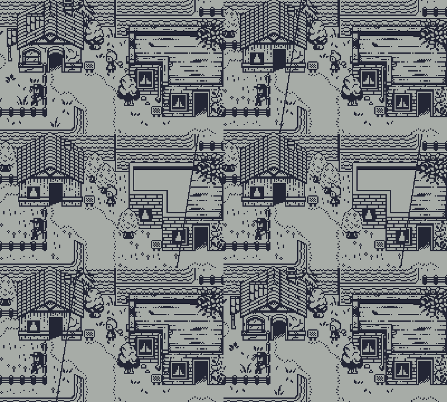
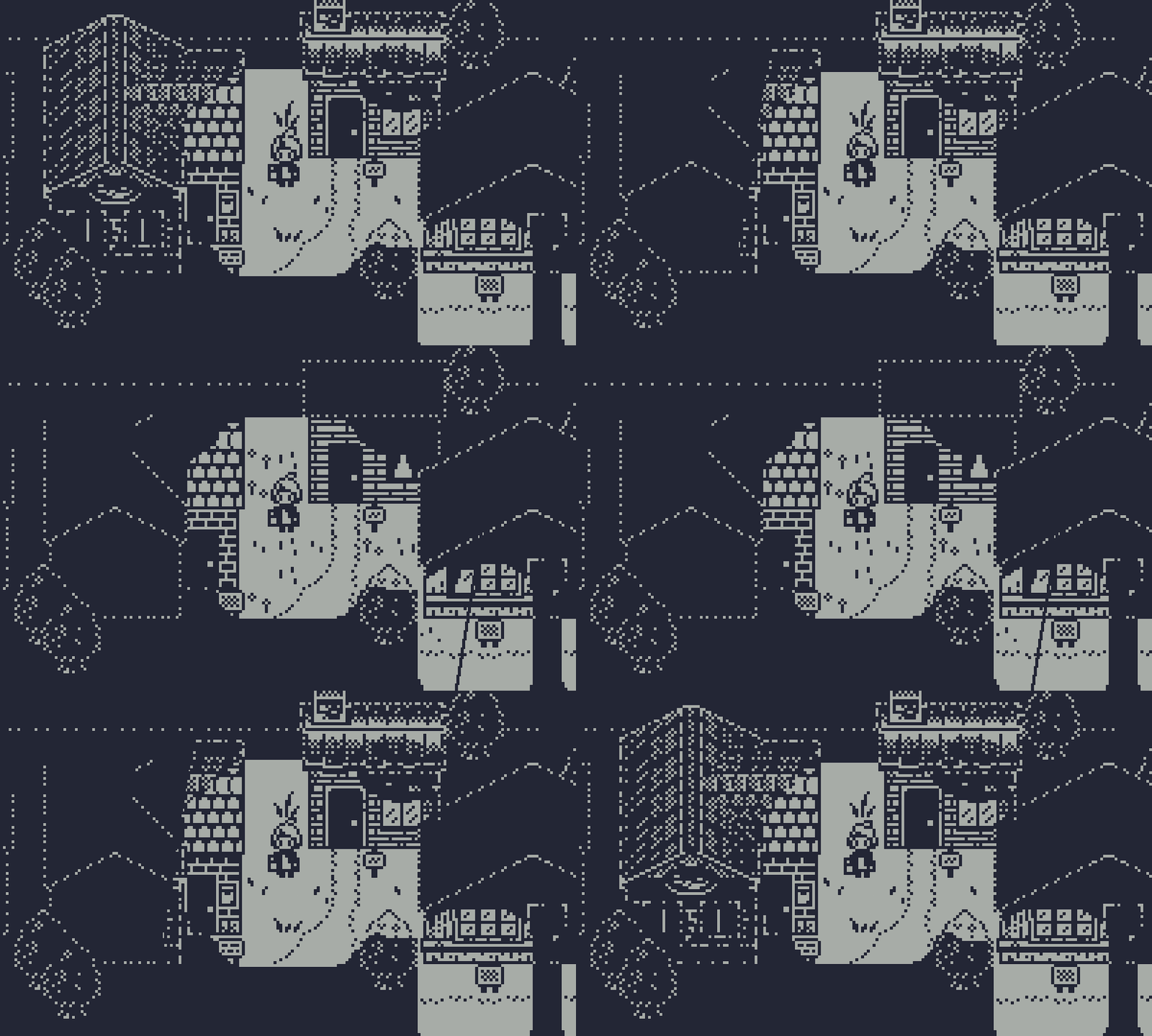
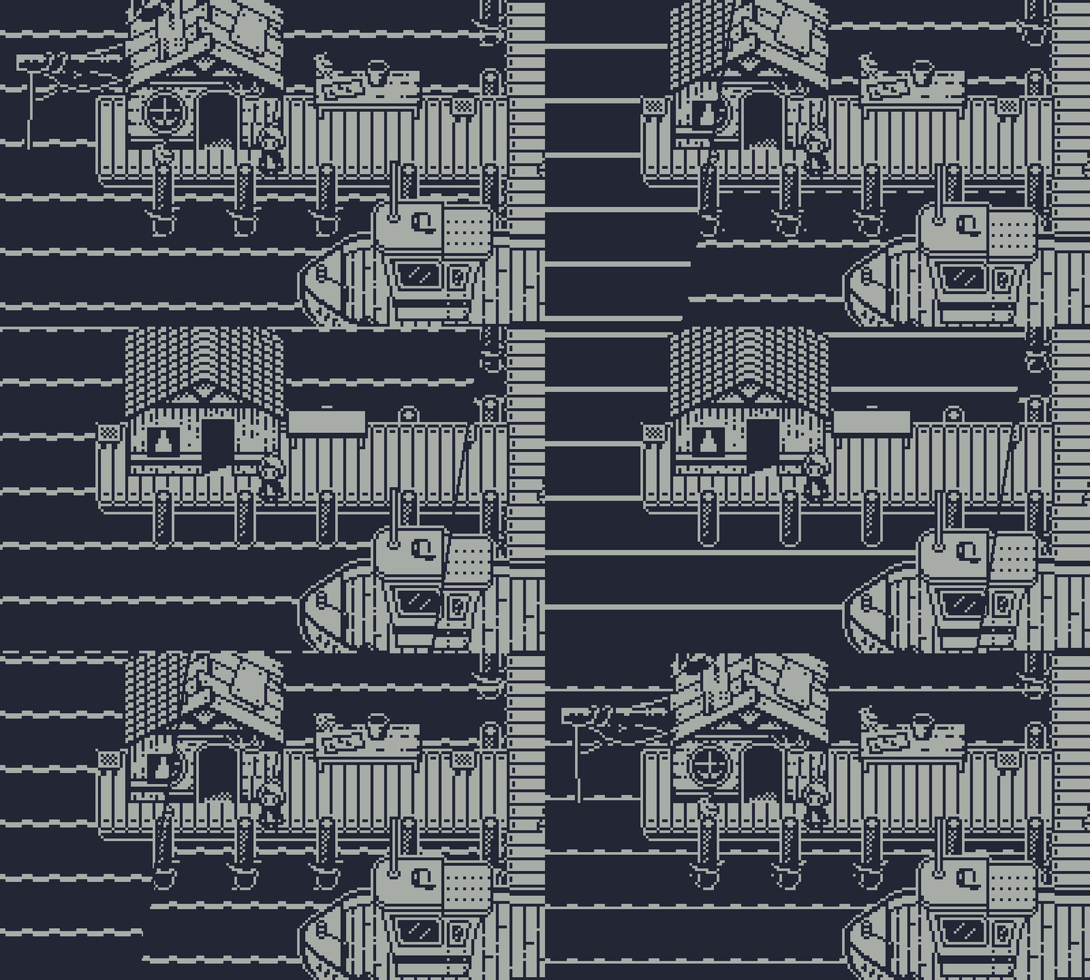
Donald did a lot of work with these houses. They have several types of readable materials, different roofs, and different shapes. That's an amazing job. What I did was add details, make buildings look more different from each other, and add personalities.
For example in the image below, the upper building stands near the lighthouse and belongs to the lighthouse keeper, so let's make it the same material as the lighthouse and highlight the connection to the player without saying there’s a connection. It also has a second exit, so why not draw it?
The lower building is a fisherman's shop, so let's add some signs, some bead curtains, and fisherman equipment outside. Also, breaking some texture patterns adds depth, making unique details like window curtains, door shadow, etc.
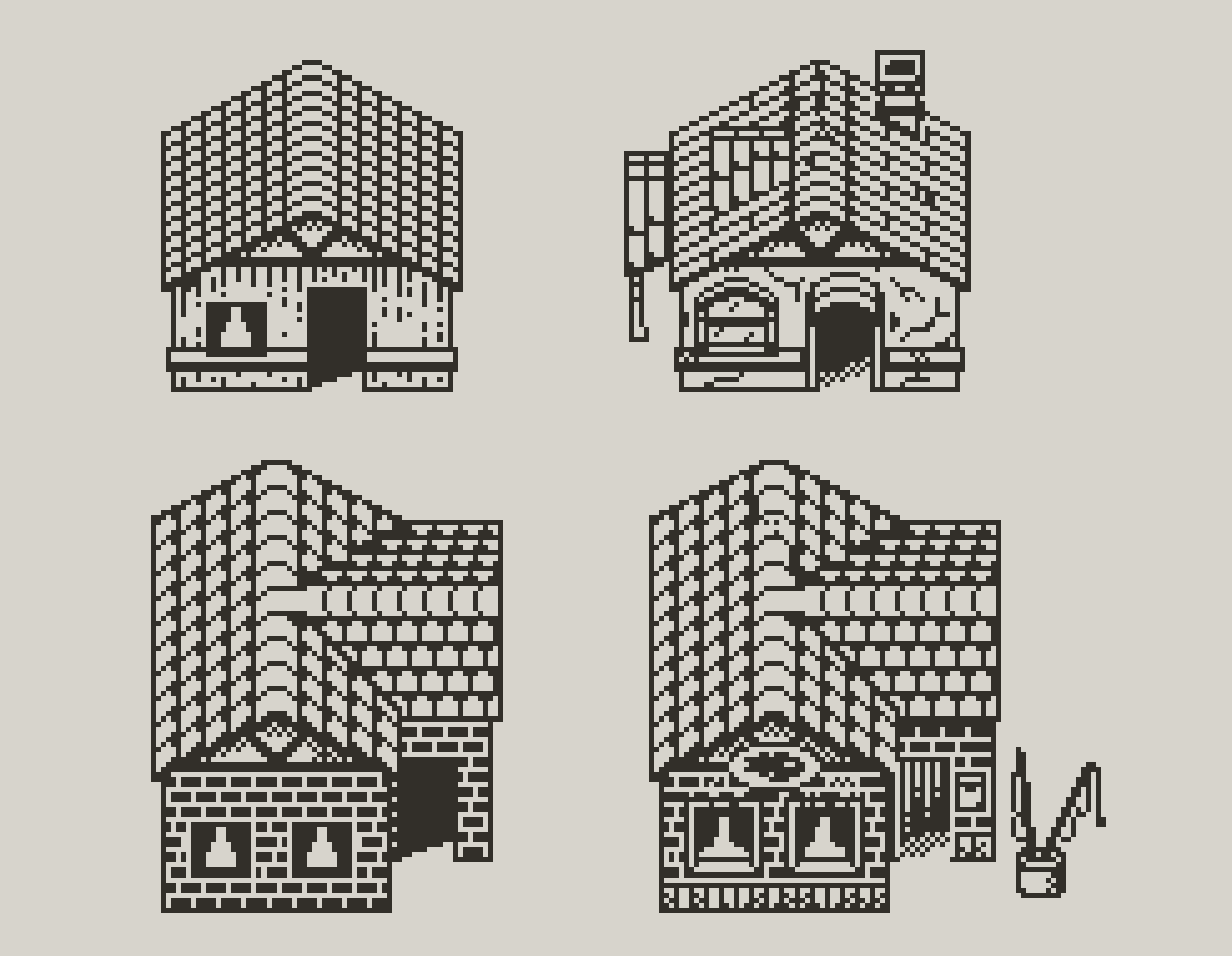
A few gifs to show you the difference.
Inspired Design
References are tools that help a lot. It's a very normal process when you take inspiration and refer to patterns and approaches in other people’s work.
There are tons of amazing games, and I took several of them as inspiration and tried to implement some of the same design features.
It's not about stealing designs, it’s about checking perspectives, colors, and many other things like that. At some point, I discovered that ink black & white paintings are good references for 1-bit art. You can study them to see how they use lights, darkness, details, etc.
I'm still experimenting and looking for the right balance between details and readability, but also think what we have now is pretty good.
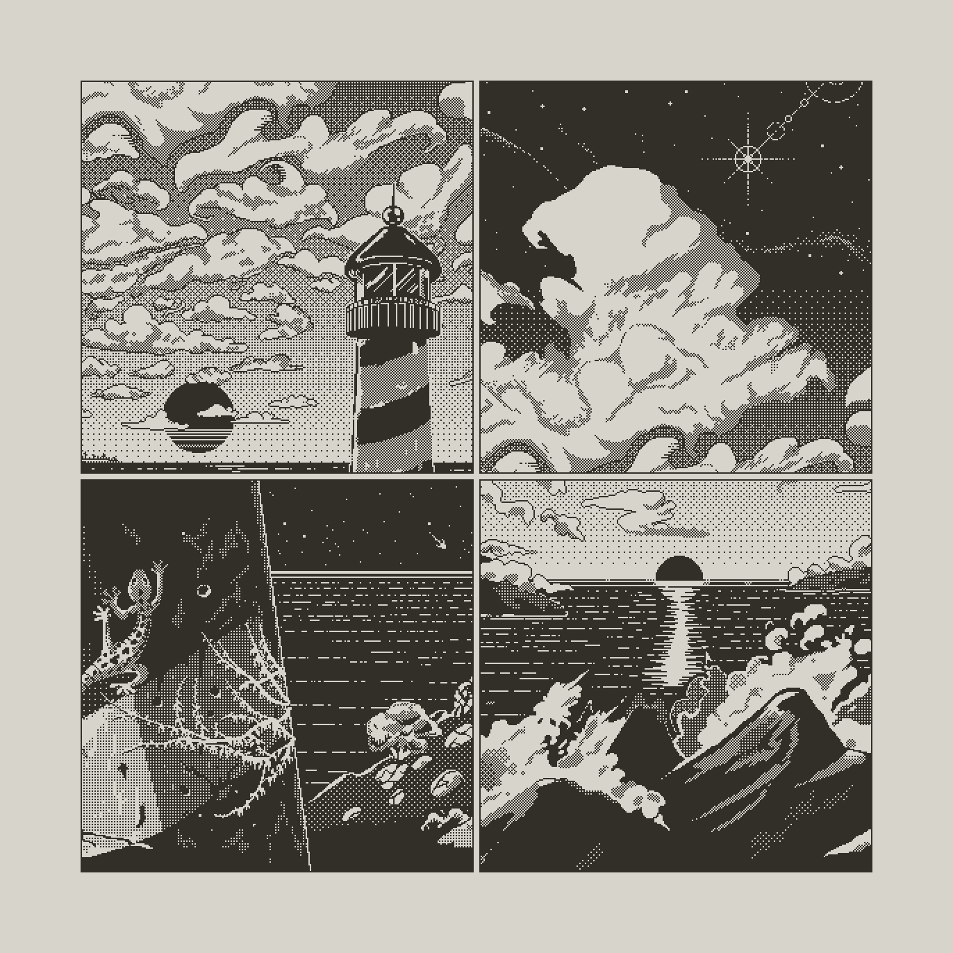
If you wanna see some more stuff I’ve made, you may follow me on the links below. I also do color pixel art and I’m also making my own card game for the Playdate. Coding is a new thing to me, but somehow it's happening. I'll share more at some point.
Kirill on Twitter/X
Kirill on LinkedIn
Pixel art stuff
Level art stuff
Stay in the light ✌️
Get Comet
Comet
A Light-hearted puzzle adventure.
| Status | In development |
| Authors | guv_bubbs, aloebach, Will Aryitey, rowdy41, xmenekai, Mouflon Cloud |
| Genre | Adventure, Puzzle |
| Tags | 1-bit, Female Protagonist, Narrative, Pixel Art, Playdate, Relaxing, Sokoban, Story Rich, Top-Down |
| Languages | English |
| Accessibility | Subtitles, High-contrast |
More posts
- Comet Dev: Hard ModeApr 30, 2025
- Milestone 6 | Light Mechanics & Engine UpgradesSep 12, 2024
- Playtesting & Character CreationJul 22, 2024
- Milestone 5 | Chapter 2 Systems, Design & FlavourJun 23, 2024
- Behind the scenes - Announcement TrailerMar 31, 2024
- Milestone 4 | Chapter 2 DraftFeb 28, 2024
- Milestone 3 | Chapter 1 PolishDec 01, 2023
- Camera workNov 06, 2023

Comments
Log in with itch.io to leave a comment.
Thank you for sharing. The art is lovely. I can't wait to play this game! Congrats on joining the team, Kirill!
Thank you!