Milestone 1 | Chapter 1 Playable!
Back again with a bunch of Comet development updates. @drew has put in a bunch of work since we last checked in.
A big focus this month was making the critical path of chapter 1 playable. This doesn't mean everything is perfect, but just that you can start the game, move though puzzles and trigger events that enable the player to get to chapter 2.
This required scripting all of the scenes that @flipdock has written for us, and a lot of testing for different "quest" lines.
Not easy to show off but an important milestone for the team.
But there's a bunch of fun stuff I can show off.
Stairs!
In the Pulp build of Comet (go back to the start of the devlog to see more of that), when walking up the steps the player would also move up and down based on the direction they were traveling.
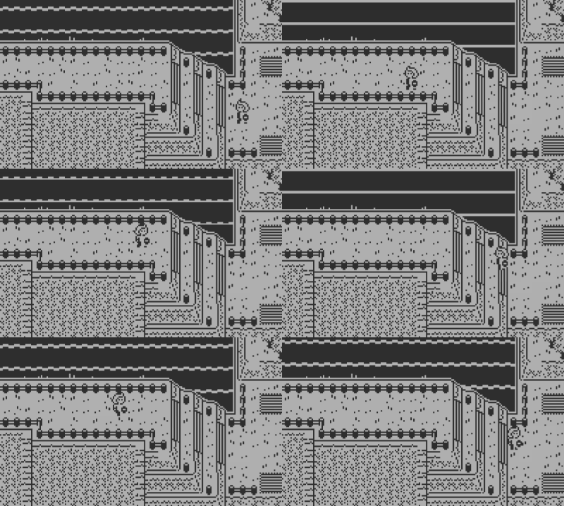
Well now that hot industry-leading stair tech has been added to the our SDK version.

It looks normal here but without it, movement over stairs feels clunky and cumbersome. And because we want environments to look interesting, it's important to make them look good.
We did also played around with putting "stairs" in areas like this to enhance the feeling of depth.
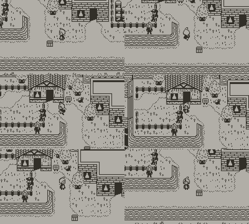
But the edge cases didn't make sense.
Lighthouse!
One of my goals with the Pulp build of Comet was to make a game that didn't look like it was made in Pulp. I didn't want people to see the tiles.
I wanted each major area to have a set piece building or object. For the fishing village, that was the lighthouse.
Here's how the lighthouse looks over two Pulp rooms.
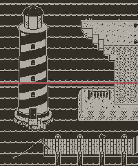
This is made up of a bunch of 8x8 tiles.
Comet now has 10x10 tiles and so the world has been scaled up a little.
Applying a 2x to the lighthouse wasn't going to work.

It needed to be something inbetween.
So we remade it.
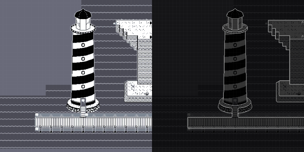
I couldn't have done it without @Maria coming in to fix my mistakes.
None of the line work on the nighttime versions of levels are final. I For now I just draw outlines.
In the future we'll go though and rough them up.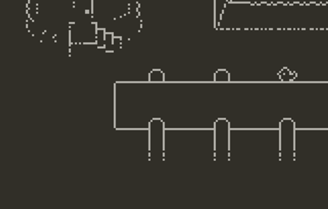
Birds
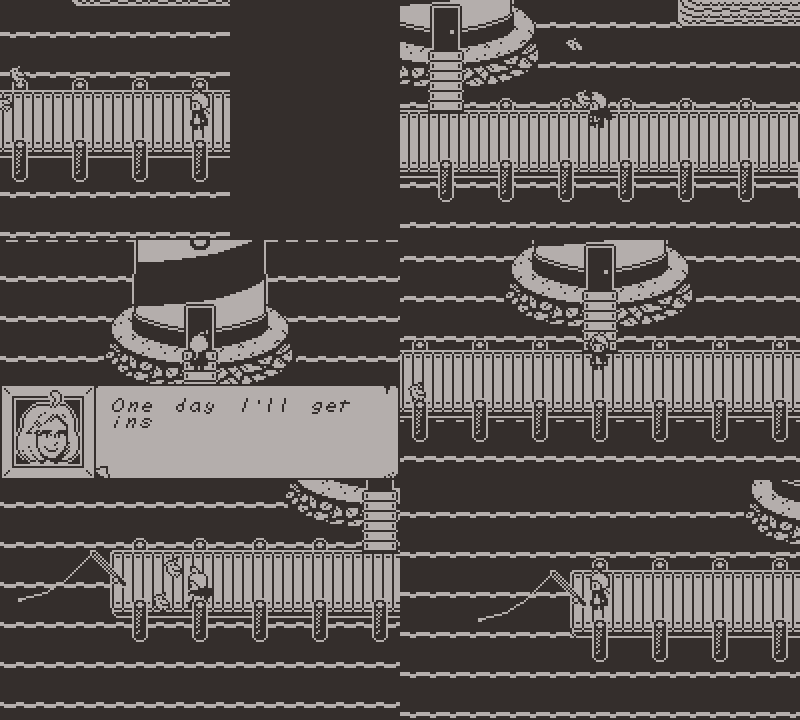
They fly!
New dialog boxes with character names
There was an idea that it might be okay for the player to remember who's who within the chapter 1 town. In testing, we noticed that it's actually quite hard to keep track of who we're speaking to and so it might be nice to display names with our dialog boxes. So I started working on a new design.
Our old dialog box was taken straight out of the Pulp build.

But it always felt flat to me.
The full SDK gives us more flexibility so if we need to add name plates, I thought I'd explore some new shapes too.
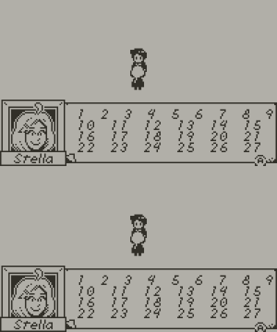
This was my first test. I thought changing the silhouette of our box could be interesting and give a sense of depth. And mocked up a button too.
@Steph and I actually mocked up this idea in Pulp

But we moved away from it for one reason or another.
After making the first mockup I tested some different name plate designs.
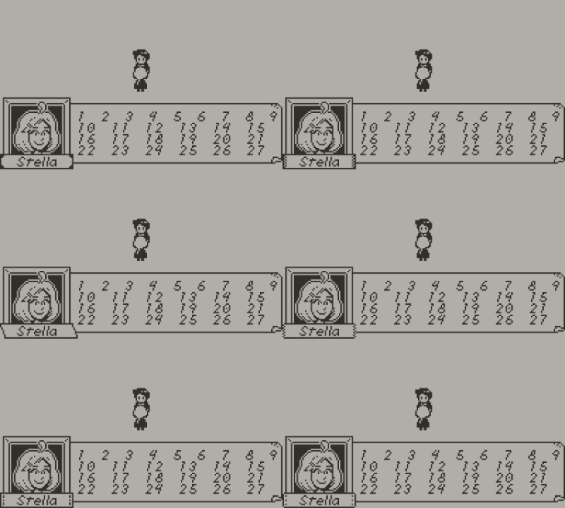
Now I stuck the portrait in the bottom left hand corner because I imagined there might be a requirement to reduce the load on Drew.
But the team really didn't think this would work.
It was too cramped and what if the name was too long for the box?
So I designed another mock up.
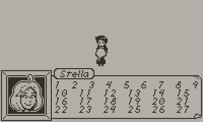
The name could be extended. Let's see how it looks in game...
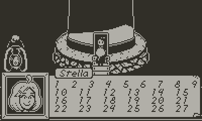
As you can see, what I thought might be an interesting design choice to have some space around the window to see the background actually results in an image that's harder to read.
At this stage, Steph was getting sick of me flailing about and made what would become our final design.
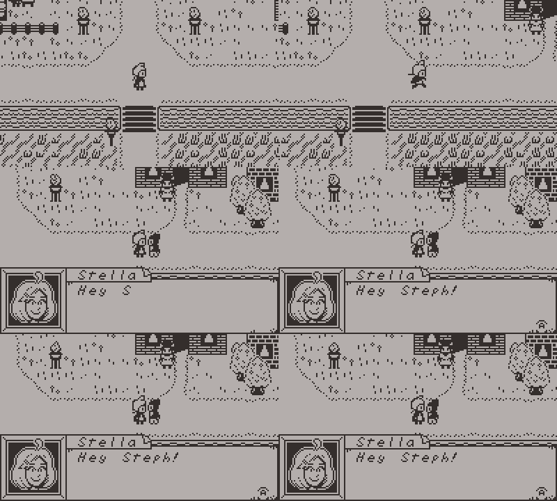
The portrait and box stick into the corners but we have a new non square shape. And a little nine slice on the name plate means it can fit most any name we throw at it.
Level art updates
The building site (AKA, the tutorial section of the game) was being used for some screenshots on our Itch page, so I needed to finish designing it.
Before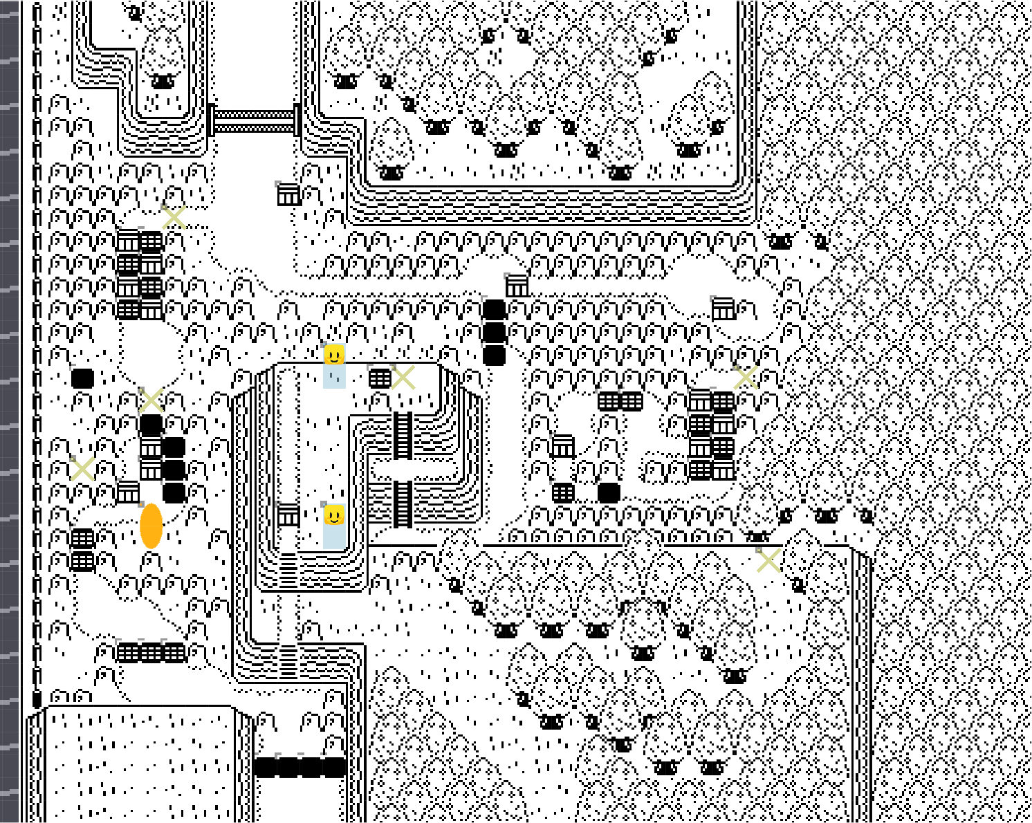
After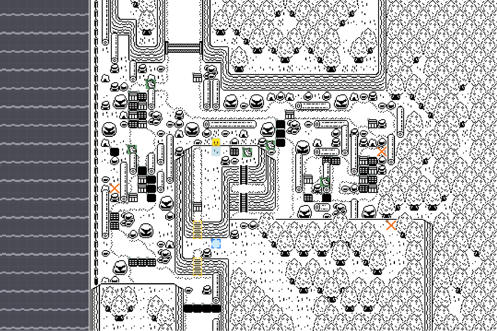
I somewhat worry this is too noisy, so it may need to be adjusted after playtesting.
When seen up close, it looks pretty good

Our beach got a glow up too.
Old
New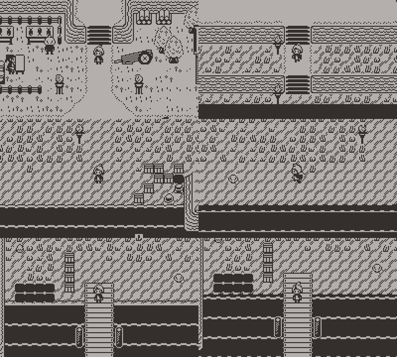
Drops
Again, to support more interesting level design and puzzles, I want to use elevations where it makes sense.
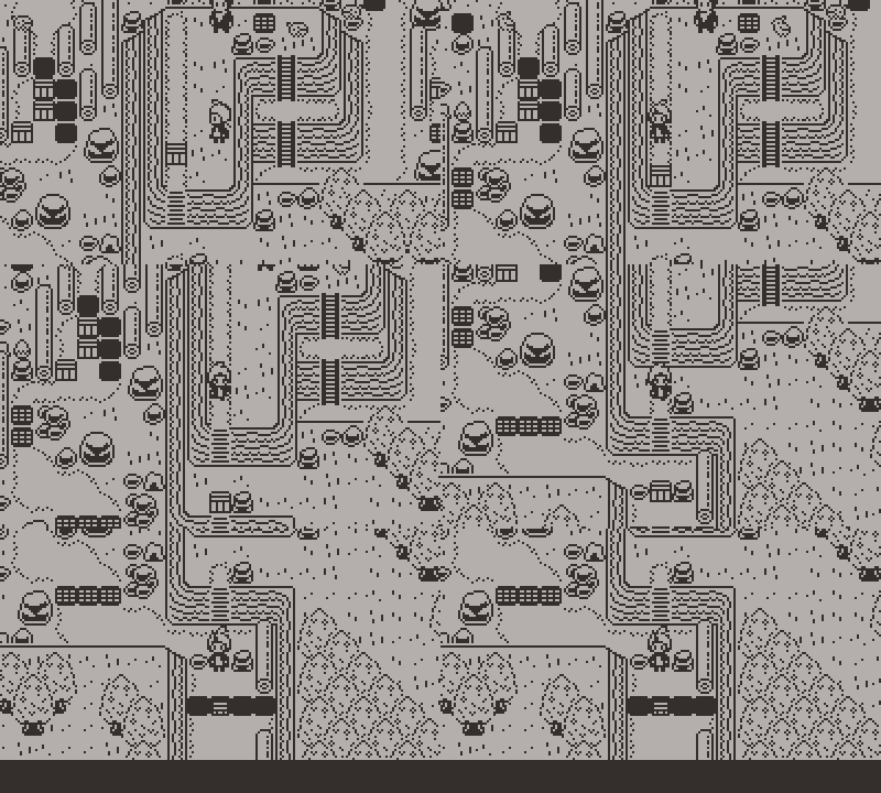
To support that we needed to make some drop entities. When a box goes down the drop it bounces an extra tile so you can still get behind it.
These are now working in game. Just place down these entities in LDtk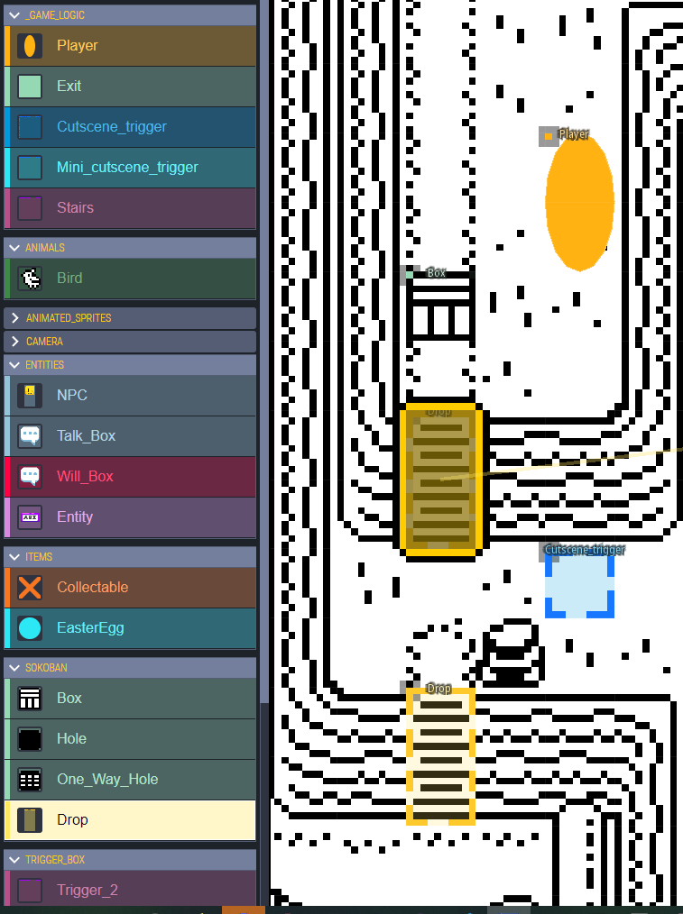
And boom!
Music
In February of 2022, I had been posting development pictures of Comet on the Playdate Squad Discord server and a guy named Triple / Kyle McAuliffe saw my work and offered to make music for Pulp.
What a talent!
I sent him over small playlist of tracks that embody the feeling that I had in mind.
From that, he was able to capture the vibe I was going for perfectly!
This is the first track he made called Fishing Village - Day
I really fell in love with the notes 24 seconds in! 😍
They still feel magical.
All of this out of Pulp's sound tools. He made 9 tracks for the game in the span of about 10 days.

Well, before the game moved to the full Playdate SDK he tried his hand at remaking some tracks in full fidelity to see what they sounded like. So when I reached out last year to formally request we rebuild them, he was excited to jump in.
It was a joy going back and forth with Kyle to remake these tracks, and while he was in the grove he made a few more.
Let the new version of Fishing Village wash over you!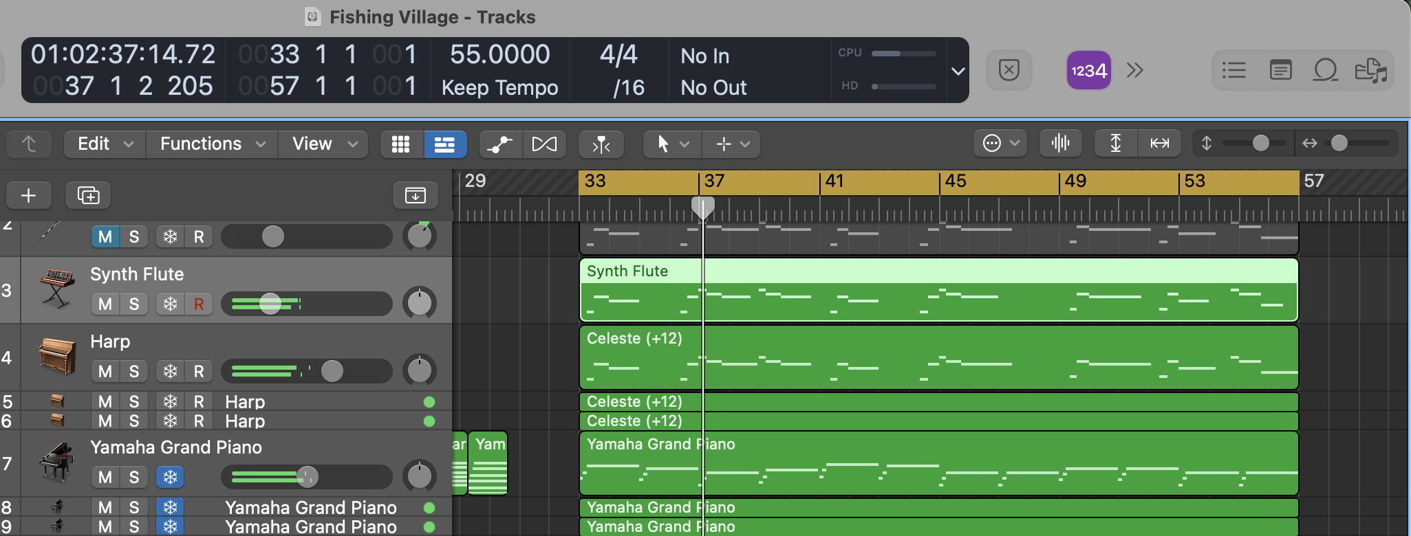
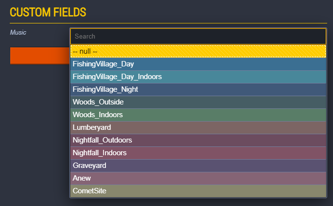
As you might have noticed, we have different arrangements of tracks based on your context.
Indoor/outdoor, day/night...
Inspired by the iMUSE system for sure! But don't expect any special transitions here :)
(Find him here: https://www.youtube.com/@tripletritone)
Get Comet
Comet
A Light-hearted puzzle adventure.
| Status | In development |
| Authors | guv_bubbs, aloebach, Will Aryitey, rowdy41, xmenekai, Mouflon Cloud |
| Genre | Adventure, Puzzle |
| Tags | 1-bit, Female Protagonist, Narrative, Pixel Art, Playdate, Relaxing, Sokoban, Story Rich, Top-Down |
| Languages | English |
| Accessibility | Subtitles, High-contrast |
More posts
- Comet Dev: Hard ModeApr 30, 2025
- Extreme Makeover: Comet EditionOct 31, 2024
- Milestone 6 | Light Mechanics & Engine UpgradesSep 12, 2024
- Playtesting & Character CreationJul 22, 2024
- Milestone 5 | Chapter 2 Systems, Design & FlavourJun 23, 2024
- Behind the scenes - Announcement TrailerMar 31, 2024
- Milestone 4 | Chapter 2 DraftFeb 28, 2024
- Milestone 3 | Chapter 1 PolishDec 01, 2023
- Camera workNov 06, 2023

Comments
Log in with itch.io to leave a comment.
Looks amazing